A wbesite & Brand Refresh
A wbesite & Brand Refresh
Echo Means Business
Echo Means Business
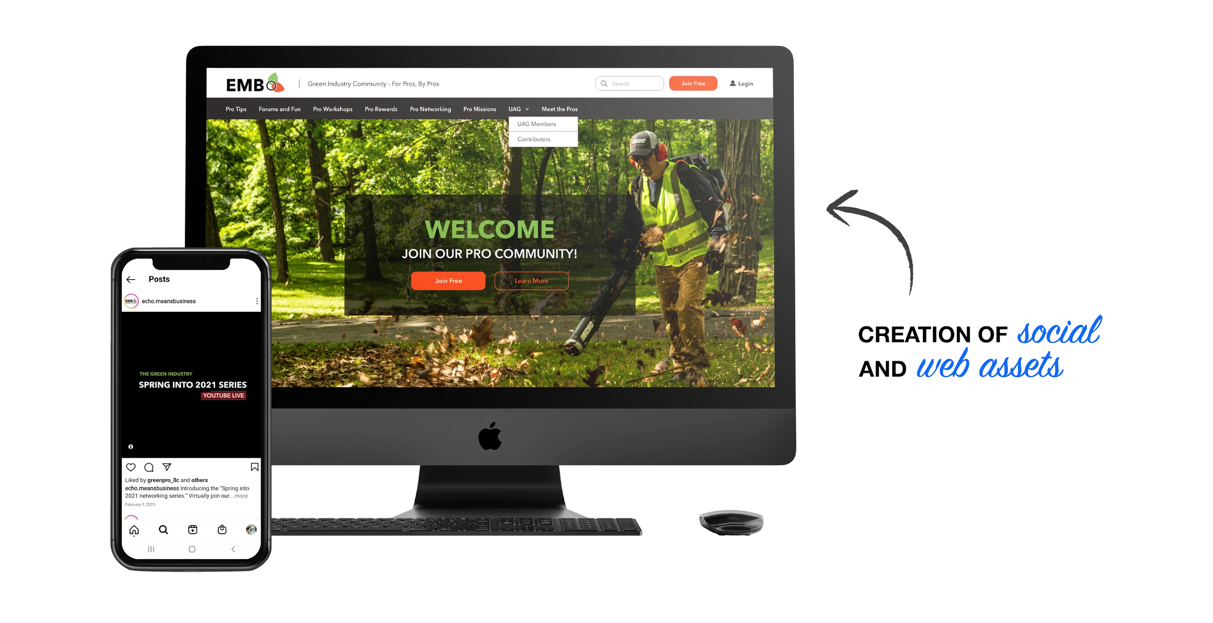
With the launch of their new website, Echo Means Business needed a logo that truly represented their community of landscapers, arborists, and outdoor professionals. I designed a mark built around connection: a circular form symbolizing community, paired with leaf elements that reflect the green industry. Using the signature ECHO and UAG palette, the result evokes a warm, fall-inspired identity. The refresh extended across a new logo, social creative, and a redesigned website experience.
With the launch of their new website, Echo Means Business needed a logo that truly represented their community of landscapers, arborists, and outdoor professionals. I designed a mark built around connection: a circular form symbolizing community, paired with leaf elements that reflect the green industry. Using the signature ECHO and UAG palette, the result evokes a warm, fall-inspired identity. The refresh extended across a new logo, social creative, and a redesigned website experience.
Created promotional videos highlighting the community and its pros.
Created promotional videos highlighting the community and its pros.


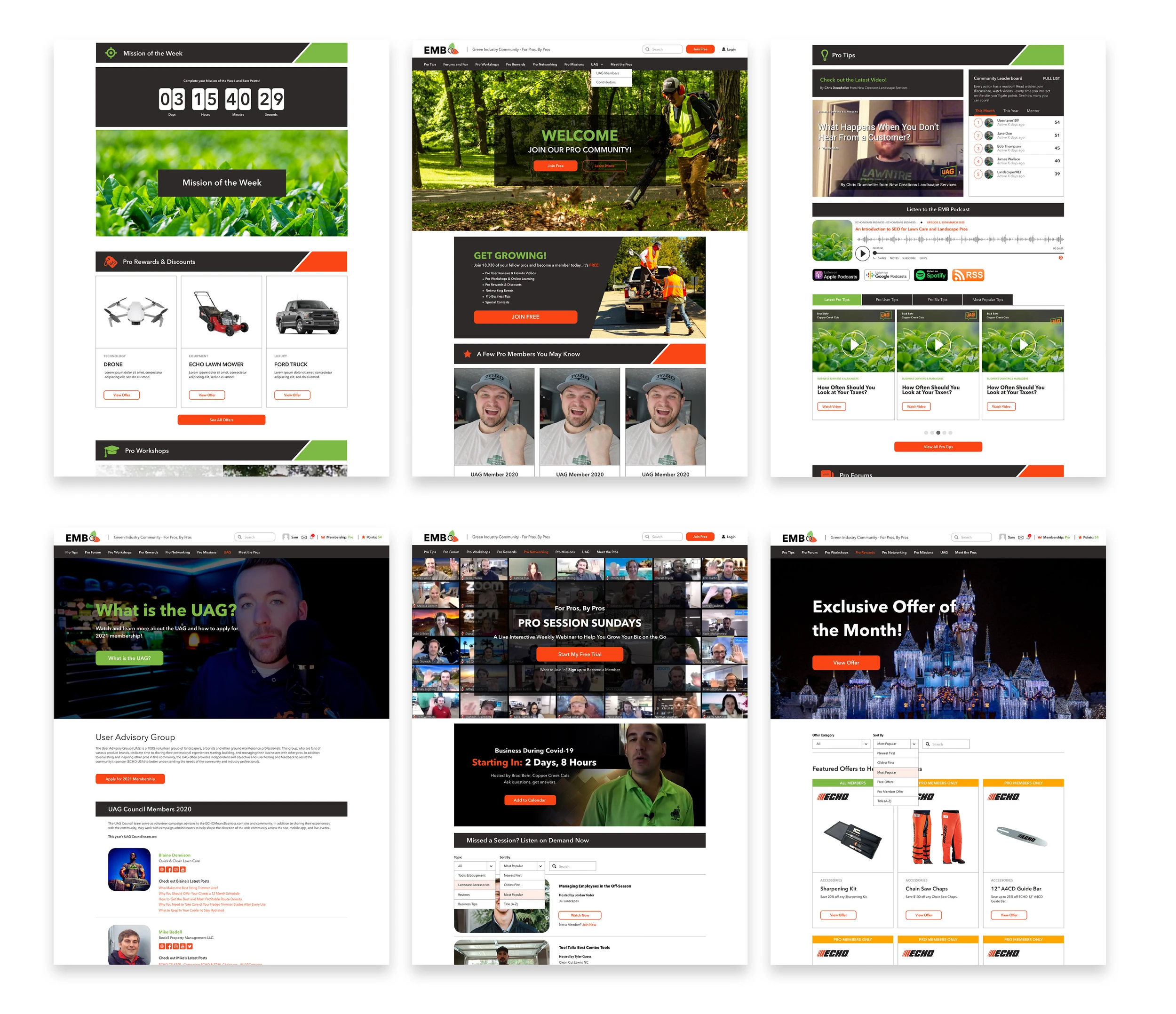
Interface Preview
A preview of the core interface screens created from scratch, illustrating the new information structure, navigation patterns, and visual direction we established for the website.