
FutureFit AI Onboarding Re-Design
Designing a first impression users could trust
Designing a first impression users could trust

Overview
Overview
Onboarding is more than data collection — it’s where trust begins. At FutureFit AI, our original flow did the opposite: it slowed users down with too many forms and too little context.
As the Senior Product Designer leading this intitiative, I reframed onboarding around clarity, trust, and momentum. I defined the experience vision, aligned Product, Data, and Engineering around a mobile-first approach, and redesigned the journey so users immediately understood why each detail mattered and how it shaped more relevant job matches.
By restructuring the experience into fewer, smarter steps and guiding users with clearer context, I helped turn onboarding from a transactional form into the beginning of a trusted relationship.
Role & Details
Role & Details
Senior Product Designer | FutureFit AI
Senior Product Designer | FutureFit AI
User Research, Interaction, Visual Design, Prototyping & Testing
User Research, Interaction, Visual Design, Prototyping & Testing
1 Product Manager, 2 Engineers, 1 Data Analyst & Head of Product
1 Product Manager, 2 Engineers, 1 Data Analyst & Head of Product
Launched in 2024
Launched in 2024
The Problem
The Problem
When does collecting valuable
data start costing user trust?
When does collecting valuable
data start costing user trust?
What was meant to be a guided, personalized journey instead left users overwhelmed and uncertain. Behind that frustration were three silent blockers:
What was meant to be a guided, personalized journey instead left users overwhelmed and uncertain. Behind that frustration were three silent blockers:
Lack of transparency
Users were asked for personal details such as postal code and date of birth without clear context, eroding trust and lowering completion rates.
More friction
Over 80% of users started on mobile, yet layouts and touch targets weren’t optimized — nearly 40% dropped off mid-flow.
Overcomplicated steps
Even adding a single work experience took 40 + taps, making the process feel like work, not progress.
User Research
User Research
What users told us &
What the data confirmed
What users told us &
What the data confirmed
User Interviews: To understand which personal details users felt comfortable sharing early and which felt intrusive, I led user interviews that helped me identify which inputs were truly essential and guided alignment with the Data team on what should be required, optional, or removed from the flow.
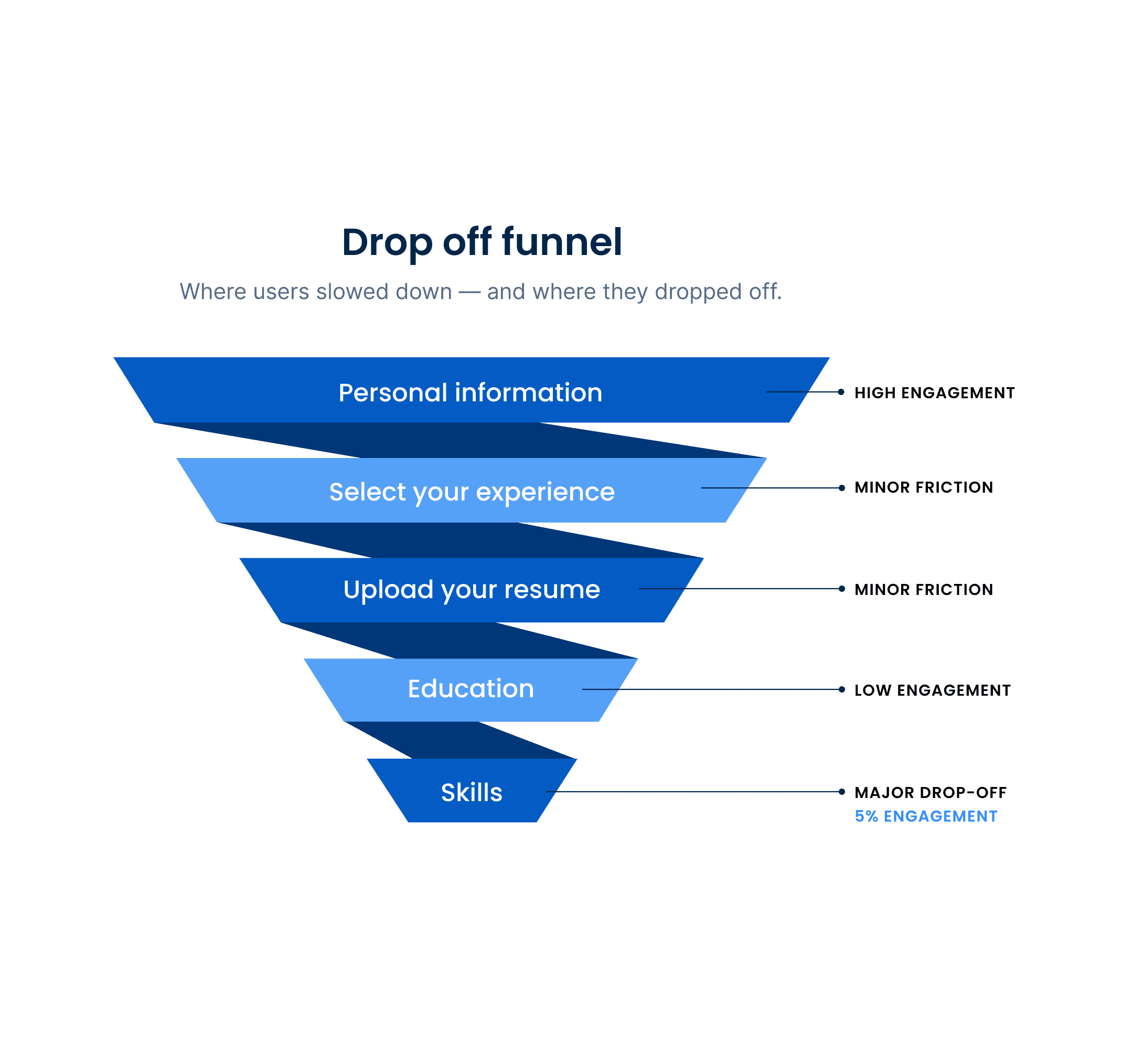
Data Analysis: Onboarding metrics highlighted clear friction points. The largest drop-off occurred on the Skills page, where most users skipped customization and relied on auto-filled defaults — a strong signal that the value wasn’t clear to users.
User Interviews: To understand which personal details users felt comfortable sharing early and which felt intrusive, I led user interviews that helped me identify which inputs were truly essential and guided alignment with the Data team on what should be required, optional, or removed from the flow.
Data Analysis: Onboarding metrics highlighted clear friction points. The largest drop-off occurred on the Skills page, where most users skipped customization and relied on auto-filled defaults — a strong signal that the value wasn’t clear to users.

Our Approach
Our Approach
So what did we do?
We made every step worth taking
So what did we do?
We made every step worth taking
As the design lead, I partnered closely with Data and Engineering to reimagine onboarding into a mobile-first, trust-driven experience. I determined which inputs were essential and redesigned the UI so non-critical fields lived in collapsible sections — giving users more control and reducing perceived effort.
User research revealed that the skills step had the lowest engagement. Based on this insight, I shifted customization to after users received their first personalized results — improving clarity and boosting completion rates.

Validation & Testing
Validation & Testing
Testing what “effortless” really means
Testing what “effortless” really means
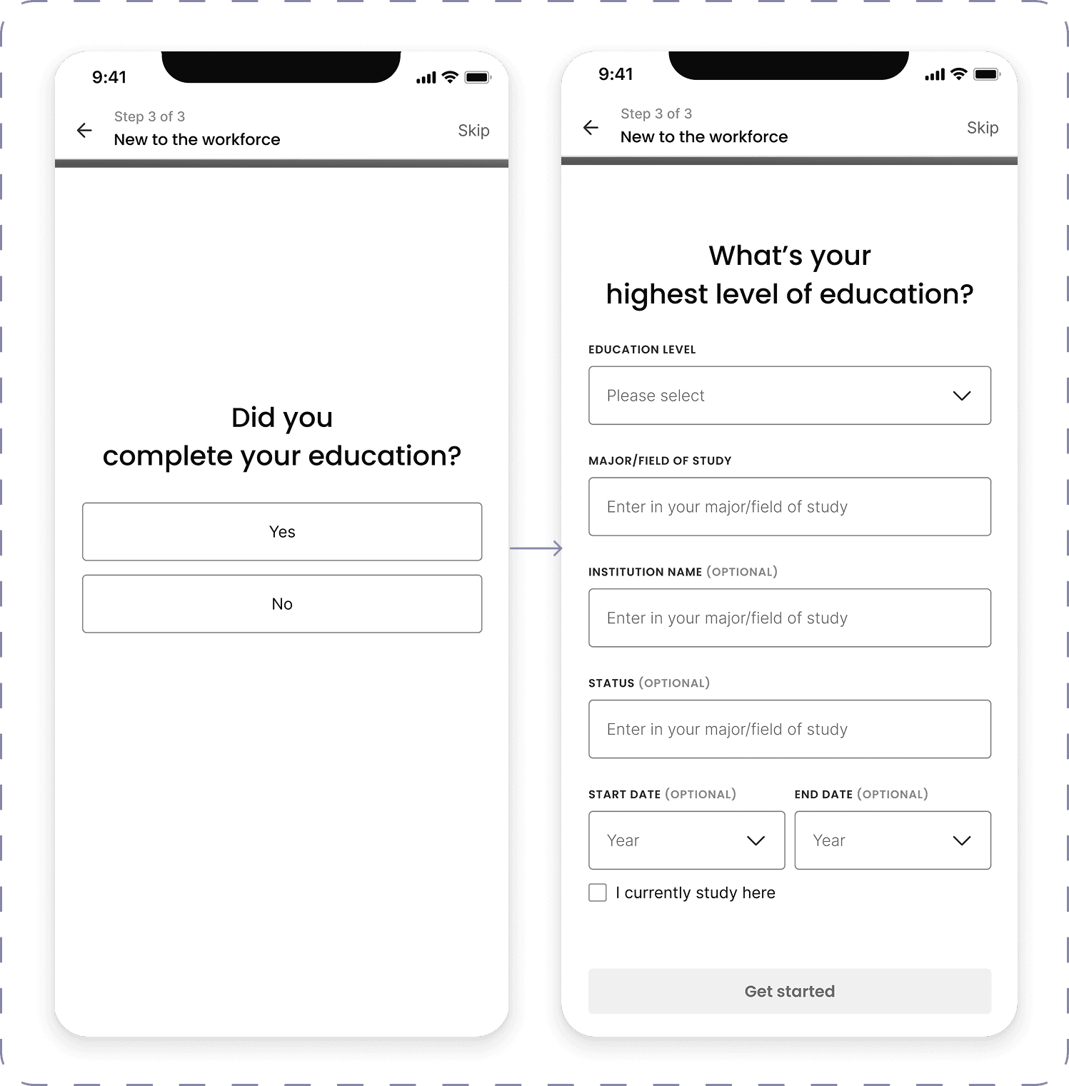
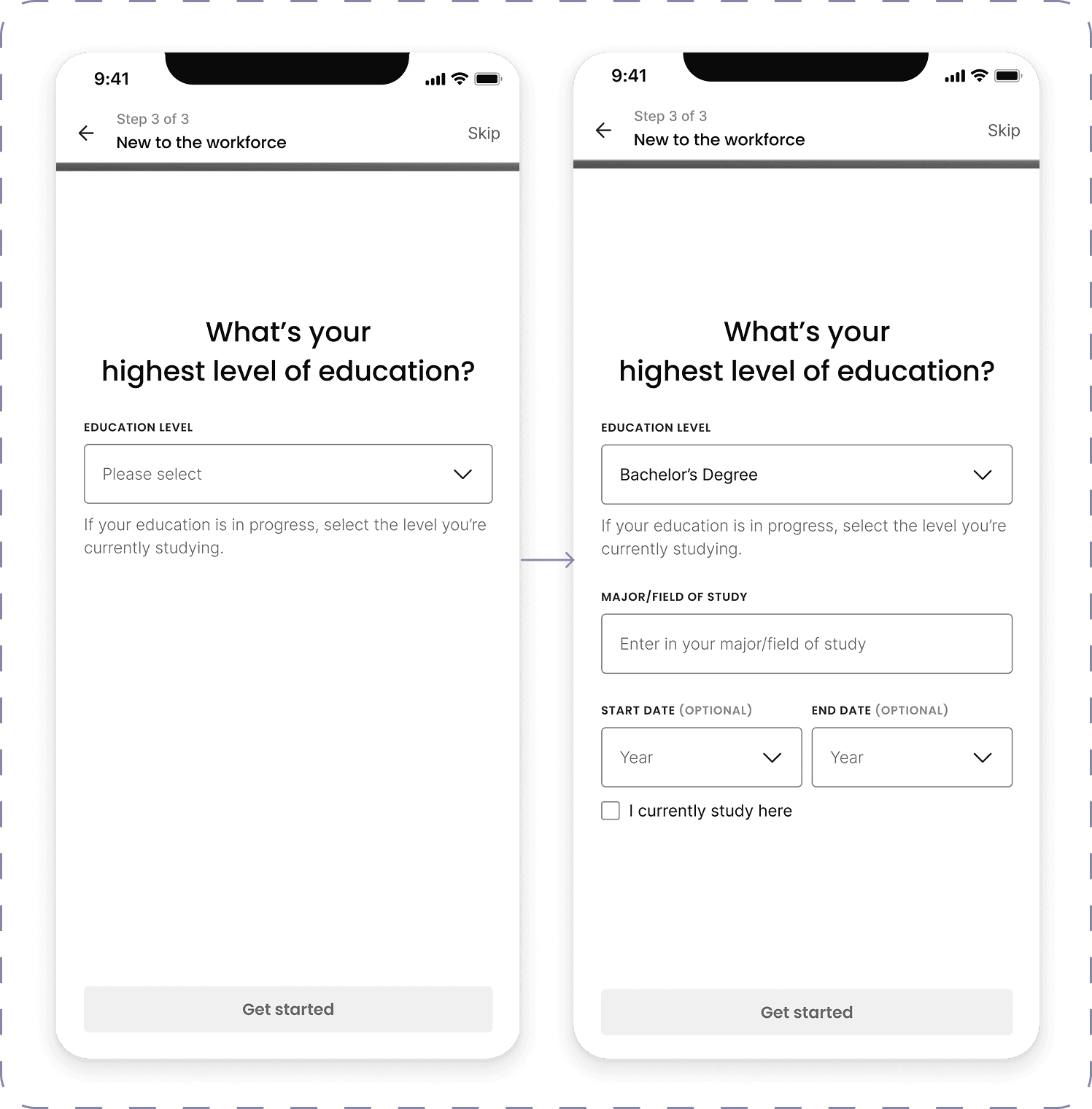
I led three rounds of user testing across multiple user types to validate the redesigned flow and identify where friction still remained. The biggest challenge appeared in Path 3 — users with no work experience — where confusion around required inputs created hesitation.
To solve this, I designed and tested two prototype variations focused on sequencing and pacing. My goal was to reduce cognitive load, clarify expectations, and ensure users could move through the form with confidence, regardless of their background.

Results
Results
Flow 2 performed best ✨
Flow 2 performed best ✨
Its progressive-reveal pattern surfaced new field groups only after the previous ones were completed, making the flow feel lighter and more predictable — and it helped us identify which pieces of information users valued most at each step.
Its progressive-reveal pattern surfaced new field groups only after the previous ones were completed, making the flow feel lighter and more predictable — and it helped us identify which pieces of information users valued most at each step.
Users completed Flow 2 the fastest
Users completed Flow 2 the fastest
Lowest dropout for “no experience” users
Lowest dropout for “no experience” users
Highest clarity rating (required vs optional fields)
Highest clarity rating (required vs optional fields)
Education inputs tested with zero confusion
Education inputs tested with zero confusion
Design solutions & Impact
Every design decision had one goal:
make the journey effortless.
Design solutions & Impact
Every design decision had one goal:
make the journey effortless.
Designed for Mobile First
Designed for Mobile First
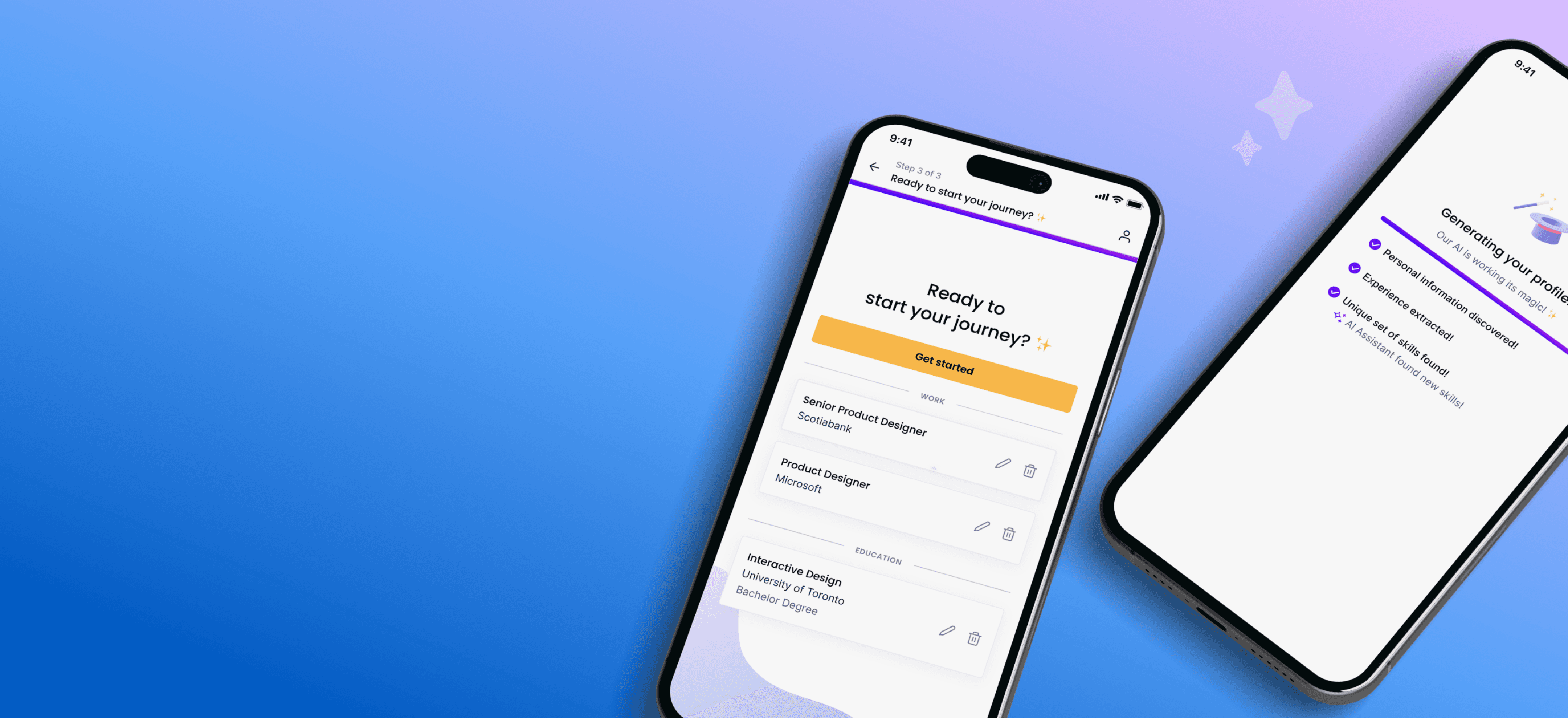
With most users onboarding via mobile, I redesigned the flow from the ground up for smaller screens. Larger touch targets, simplified layouts, and slider modals made editing intuitive, and we used lightweight animations during résumé parsing to add delight and reassurance.
With most users onboarding via mobile, I redesigned the flow from the ground up for smaller screens. Larger touch targets, simplified layouts, and slider modals made editing intuitive, and we used lightweight animations during résumé parsing to add delight and reassurance.
Impact
Impact
Usability testing and post-launch analytics showed a 35–40% decrease in mobile drop-offs, reflecting smoother navigation and higher task confidence.
Usability testing and post-launch analytics showed a 35–40% decrease in mobile drop-offs, reflecting smoother navigation and higher task confidence.
Simplified Flow, Faster Value
Simplified Flow, Faster Value
I removed unnecessary steps and focused the flow on essential inputs, placing optional details in collapsible sections to reduce perceived effort. We added inline validation to help users complete the flow quickly and confidently.
I removed unnecessary steps and focused the flow on essential inputs, placing optional details in collapsible sections to reduce perceived effort. We added inline validation to help users complete the flow quickly and confidently.
Impact
Impact
Onboarding completion increased ~24%, and average completion time dropped from 4 min 15 sec to under 2 min, helping users reach value nearly twice as fast.
Onboarding completion increased ~24%, and average completion time dropped from 4 min 15 sec to under 2 min, helping users reach value nearly twice as fast.

Scalable for Future Personalization
Scalable for Future Personalization
I restructured the onboarding framework to support modular, goal-based questions (e.g., “What is your goal?”). This gives Product and Data the ability to introduce deeper personalization layers without reworking the flow.
Impact: A future-ready system that evolves with the product — enabling continuous personalization while maintaining a seamless, low-friction experience.
Impact: A future-ready system that evolves with the product — enabling continuous personalization while maintaining a seamless, low-friction experience.

Reflection
Reflection
Design that listens, learns, and simplifies.
Design that listens, learns, and simplifies.
This project reinforced that great onboarding lives at the intersection of empathy and efficiency. As the Senior Product Designer leading the work, I partnered closely with Product and Data to simplify a complex system without weakening the intelligence that powers our recommendations.
The improvements — from reducing unnecessary inputs to restructuring key decision points — showed that even small reductions in friction can build real trust and engagement. It was a clear reminder that in product design, less truly is more — and that even the most technical experiences can feel human when they’re shaped with intention and clarity.

FutureFit AI Onboarding Re-Design
Designing a first impression users could trust
FutureFit AI Onboarding Re-Design
Designing a first impression users could trust
Overview
Onboarding is more than data collection — it’s where trust begins. At FutureFit AI, our original flow did the opposite: it slowed users down with too many forms and too little context.
As the Senior Product Designer leading this intitiative, I reframed onboarding around clarity, trust, and momentum. I defined the experience vision, aligned Product, Data, and Engineering around a mobile-first approach, and redesigned the journey so users immediately understood why each detail mattered and how it shaped more relevant job matches.
By restructuring the experience into fewer, smarter steps and guiding users with clearer context, I helped turn onboarding from a transactional form into the beginning of a trusted relationship.
Role & Details
Senior Product Designer | FutureFit AI
User Research, Interaction, Visual Design, Prototyping & Testing
1 Product Manager, 2 Engineers, 1 Data Analyst & Head of Product
Launched in 2024
The Problem
When does collecting valuable data start costing user trust?
What was meant to be a guided, personalized journey instead left users overwhelmed and uncertain. Behind that frustration were three silent blockers:
Lack of transparency
Users were asked for personal details such as postal code and date of birth without clear context, eroding trust and lowering completion rates.
More friction
Over 80% of users started on mobile, yet layouts and touch targets weren’t optimized — nearly 40% dropped off mid-flow.
Overcomplicated steps
Even adding a single work experience took 40 + taps, making the process feel like work, not progress.
User Research
What users told us &
What the data confirmed
User Interviews: To understand which personal details users felt comfortable sharing early and which felt intrusive, I led user interviews that helped me identify which inputs were truly essential and guided alignment with the Data team on what should be required, optional, or removed from the flow.
Data Analysis: Onboarding metrics highlighted clear friction points. The largest drop-off occurred on the Skills page, where most users skipped customization and relied on auto-filled defaults — a strong signal that the value wasn’t clear to users.

Our Approach
So what did we do?
We made every step worth taking
As the design lead, I partnered closely with Data and Engineering to reimagine onboarding into a mobile-first, trust-driven experience. I determined which inputs were essential and redesigned the UI so non-critical fields lived in collapsible sections — giving users more control and reducing perceived effort.
User research revealed that the skills step had the lowest engagement. Based on this insight, I shifted customization to after users received their first personalized results — improving clarity and boosting completion rates.
Validation & Testing
Testing what
“effortless” really means
I led three rounds of user testing across multiple user types to validate the redesigned flow and identify where friction still remained. The biggest challenge appeared in Path 3 — users with no work experience — where confusion around required inputs created hesitation.
To solve this, I designed and tested two prototype variations focused on sequencing and pacing. My goal was to reduce cognitive load, clarify expectations, and ensure users could move through the form with confidence, regardless of their background.
FLOW 1: SEGMENTED SINGLE-PAGE FLOW
FLOW 2: PROGRESSIVE REVEAL


Design solutions & Impact
Every design decision had one goal: make the journey effortless.
Designed for Mobile First
With most users onboarding via mobile, I redesigned the flow from the ground up for smaller screens. Larger touch targets, simplified layouts, and slider modals made editing intuitive, and we used lightweight animations during résumé parsing to add delight and reassurance.
Impact
Usability testing and post-launch analytics showed a 35–40% decrease in mobile drop-offs, reflecting smoother navigation and higher task confidence.
Simplified Flow, Faster Value
I removed unnecessary steps and focused the flow on essential inputs, placing optional details in collapsible sections to reduce perceived effort. We added inline validation to help users complete the flow quickly and confidently.
Impact
Onboarding completion increased ~24%, and average completion time dropped from 4 min 15 sec to under 2 min, helping users reach value nearly twice as fast.

Scalable for Future Personalization
I restructured the onboarding framework to support modular, goal-based questions (e.g., “What is your goal?”). This gives Product and Data the ability to introduce deeper personalization layers without reworking the flow.
Impact
A future-ready system that evolves with the product — enabling continuous personalization while maintaining a seamless, low-friction experience.
Reflection
Design that listens, learns, and simplifies.
This project reinforced that great onboarding lives at the intersection of empathy and efficiency. As the Senior Product Designer leading the work, I partnered closely with Product and Data to simplify a complex system without weakening the intelligence that powers our recommendations.
The improvements — from reducing unnecessary inputs to restructuring key decision points — showed that even small reductions in friction can build real trust and engagement. It was a clear reminder that in product design, less truly is more — and that even the most technical experiences can feel human when they’re shaped with intention and clarity.
Results
Flow 2
performed best ✨
Its progressive-reveal pattern surfaced new field groups only after the previous ones were completed, making the flow feel lighter and more predictable — and it helped us identify which pieces of information users valued most at each step.
Users completed Flow 2 the fastest
Lowest dropout for “no experience” users
Highest clarity rating (required vs optional fields)
Education inputs tested with zero confusion