Motion Design / Creative Direction
Building better relationships using Bondai
Download the case study to learn more about the design approach to help connect with our users and understand their growing pains/needs while creating a better user experience.
The Challenge
Trying to convey the goals and capabilities of BONDAI has always been the biggest challenge. Understanding what we do meant investing in an hour long conversation or reading excessive text that most people would just skip.
So how do we educate the audience about BONDAI in an entertaining yet informative way while staying consistent with the BONDAI brand?
We make an explainer video!
Research/Moodboard
Before diving into the main course of the design process, we had to research which style concept would best fit with this video and stay consistent to our existing brand style. Through our research, we found a lot of inspiration like transitions and layouts that focused on utilizing the circle and simple backgrounds with focus on a clean, bold typeface.
A mood board displaying various concept styles that were used as inspiration.
Storyboard
After thorough research, we began drafting a concept for the storyboard and script which went through a couple of revisions before arriving at a finalized version.

A preview of what the beginning of the video would look like through the finalized storyboard version.
Production
After thorough research, we began drafting a concept for the storyboard and script which went through a couple of revisions before arriving at a finalized version.

Images of the lifecycle wheel and backgrounds used in the video created by the Junior Designer.
This motion design project was edited in the program After Effects. Some examples to the right display how we used the graphic assets.
Post Production
In the last stage of this design process, I edited everything together into a first draft that was followed by revisions into a final version. Using the final composition, music and voice-over was implemented as the finishing touch and the video was complete!

The explainer video helps the audience grasp a better understanding of BONDAI and how it could be beneficial to them. To put it simply, it’s short and entertaining but educational at the same time. It highlights our brand throughout the video by taking the audience on a journey with the circle. It also connects to them on a more personal and relatable level by focusing on human emotions.
Download the case study to learn more about the design approach behind the video.
The Solution

Design Approach
A comparison of the original concept to the finalized version that helped improve the user experience and overall quality of the composition.
Branding Gone Wrong
Problem
Throughout this video, we definitely wanted to have consistent branding by using the circle
shape. However, overusing it on a single frame resulted to a busy layout which contrasted from
the clean and simple concept we were originally aiming for.


Original concept: In this frame, we tried to show information while focusing on circle shapes to stay on brand but resulted into an over crowded frame.
Let’s Go On a Journey!
Solution
For a more innovative approach, we used the circle to take the audience on an easy-to-follow journey throughout the video. By doing this, we created a composition that was less busy, transitions were more fluid but most importantly the branding stayed consistent.
Finalized Concept: A short section from the storyboard showing how the circular theme is animated through a smooth transition to take the audience from the lifecycle screen to the following steps.

Can’t Relate?
Presenting the problems as square boxes or animated text didn’t convey our message properly. It lacked the emotional connection and didn’t feel personal or relatable.
Problem

Original Concept: We show problems (without using BONDAI) that people at work have potentially experienced. In the images above, they are presented as text on backgrounds which created a disconnect from our target audience.
Using Emotions Is a Powerful Tool
We made use of images that showed strong feelings of frustration and disappointment. By doing this, it created an emotional connection to our audience who could potentially relate to these problems. Instead of using one voice for all the problems, we chose to use a variety which made it feel more personal and realistic.
Solution

Finalized Concept: Each individual expresses what their problems are through their own voices and emotions.
No Hierarchy
Problem
We made use of images that showed strong feelings of frustration and disappointment. By doing this, it created an emotional connection to our audience who could potentially relate to these problems. Instead of using one voice for all the problems, we chose to use a variety which made it feel more personal and realistic.
Original Concept: The concept above shows logos animating in while footage plays in the centre. This is distracting and removes focus from the central component. There are too many moving pieces creating clutter.
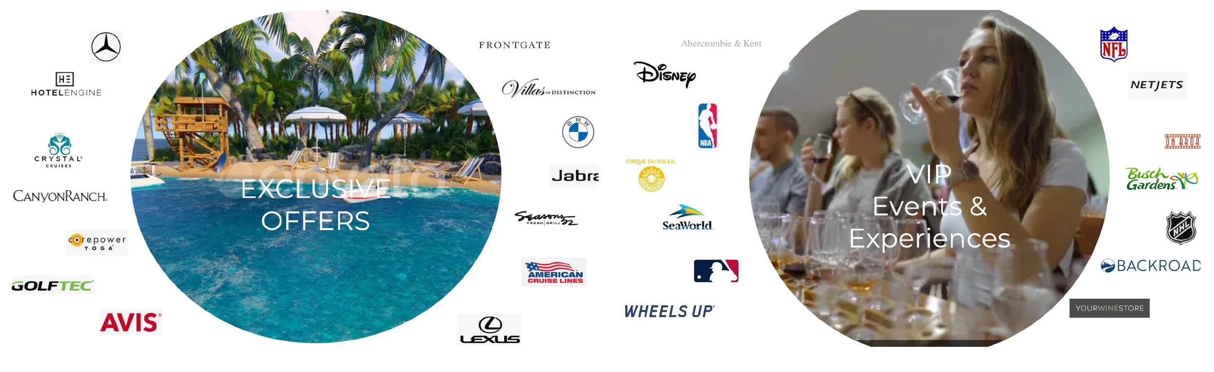
One Focal Point
Solution
Creating new graphic assets helped elevate the focal point on the layout. This gave the audience a visual hierarchy and focuses attention on the central component. This allowed the audience to have breathing room to look around without feeling overwhelmed and distracted.

Finalized Concept: The images above focus on the footage playing in the middle of the circle. The logos in the background are secondary information that the audience can take in without too much distraction. This eliminates any ambiguity and displays a clear hierarchy on the layout.